Gallery
This gallery showcases the variety of plots you can create with gleplot.
All examples are generated from the example suite in the examples directory.
Basic Plots
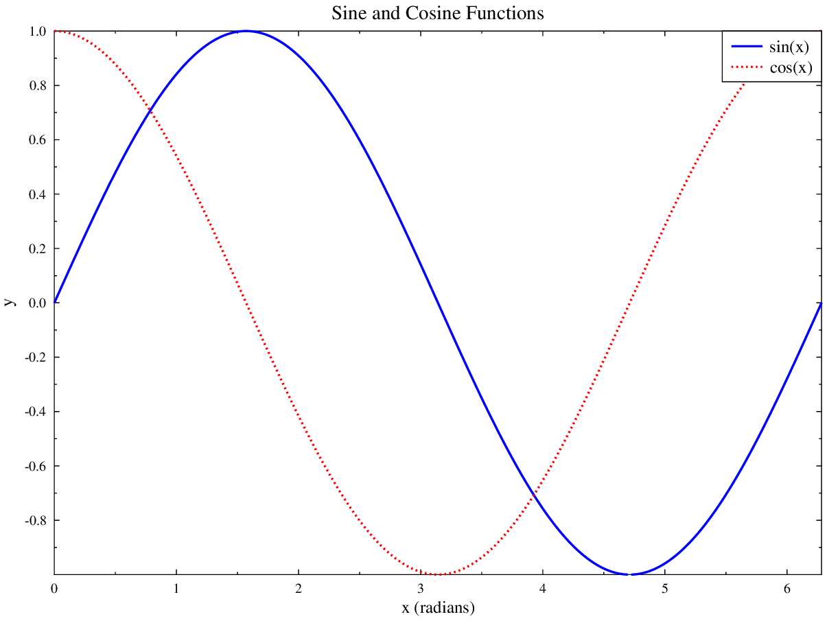
Line Plot
Line plot showing sine and cosine with custom colors and line styles.
import numpy as np
import gleplot as glp

fig = glp.figure(figsize=(8, 6))
ax = fig.add_subplot(111)

x = np.linspace(0, 2*np.pi, 100)
ax.plot(x, np.sin(x), color='blue', label='sin(x)', linestyle='-')
ax.plot(x, np.cos(x), color='red', label='cos(x)', linestyle='--')

ax.set_xlabel('x (radians)')
ax.set_ylabel('y')
ax.set_title('Sine and Cosine Functions')
ax.legend()

fig.savefig('example_basic_line_plot.pdf')
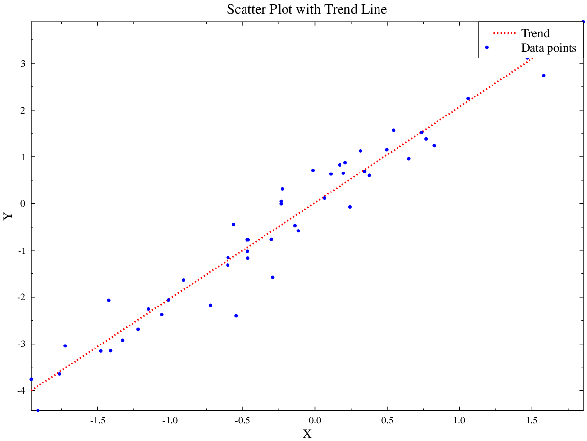
Scatter Plot
Scatter plot with a linear trend line fitted to random data.
import numpy as np
import gleplot as glp

fig = glp.figure(figsize=(8, 6))
ax = fig.add_subplot(111)

np.random.seed(42)
n = 50
x = np.random.randn(n)
y = 2*x + np.random.randn(n) * 0.5

ax.scatter(x, y, color='blue', s=20, marker='o', label='Data points')

z = np.polyfit(x, y, 1)
p = np.poly1d(z)
x_line = np.linspace(x.min(), x.max(), 100)
ax.plot(x_line, p(x_line), color='red', linestyle='--', label='Trend')

ax.set_xlabel('X')
ax.set_ylabel('Y')
ax.set_title('Scatter Plot with Trend Line')
ax.legend()

fig.savefig('example_scatter_plot.pdf')
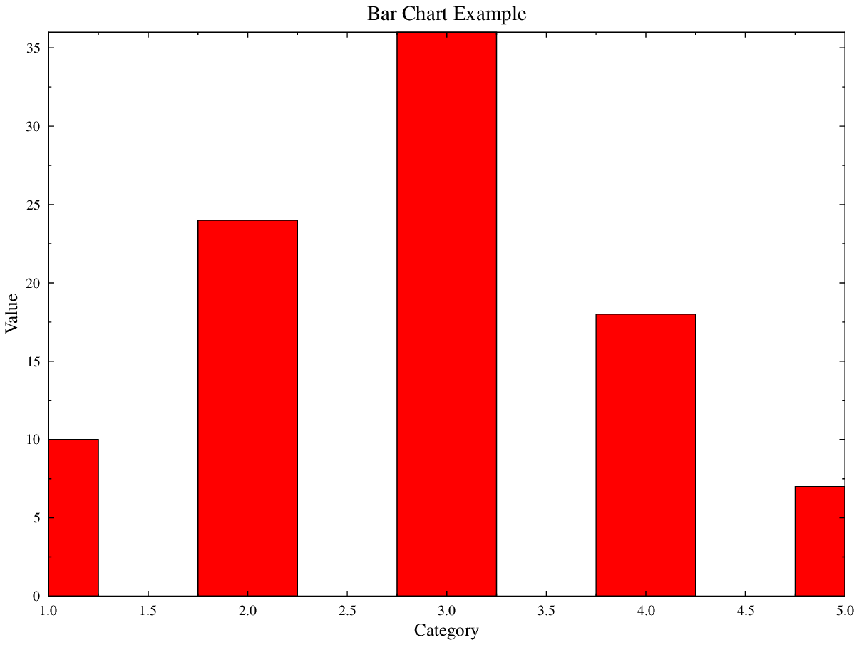
Bar Chart
Multi-color bar chart showing categorical data.
import numpy as np
import gleplot as glp

fig = glp.figure(figsize=(8, 6))
ax = fig.add_subplot(111)

categories = np.array([1, 2, 3, 4, 5])
values = np.array([10, 24, 36, 18, 7])
colors = ['red', 'blue', 'green', 'orange', 'purple']

ax.bar(categories, values, color=colors, label='Values')

ax.set_xlabel('Category')
ax.set_ylabel('Value')
ax.set_title('Bar Chart Example')
ax.legend()

fig.savefig('example_bar_chart.pdf')
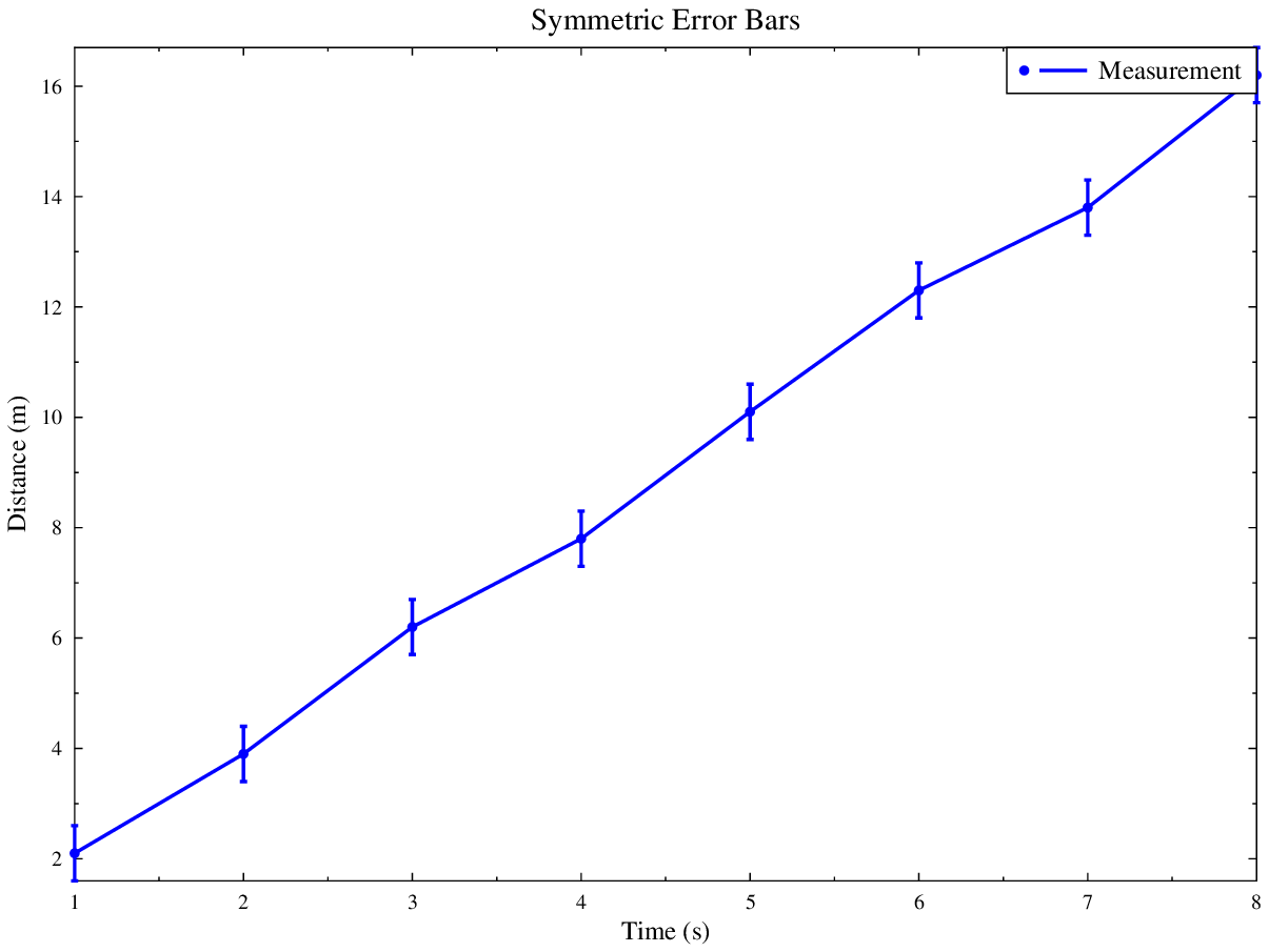
Error Bars
Symmetric vertical error bars showing measurement uncertainty.
import numpy as np
import gleplot as glp

fig = glp.figure(figsize=(8, 6))
ax = fig.add_subplot(111)

x = np.array([1, 2, 3, 4, 5, 6, 7, 8])
y = np.array([2.1, 3.9, 6.2, 7.8, 10.1, 12.3, 13.8, 16.2])

ax.errorbar(x, y, yerr=0.5, marker='o', fmt='-', color='blue',
            label='Measurement')

ax.set_xlabel('Time (s)')
ax.set_ylabel('Distance (m)')
ax.set_title('Symmetric Error Bars')
ax.legend()

fig.savefig('example_symmetric_error_bars.pdf')
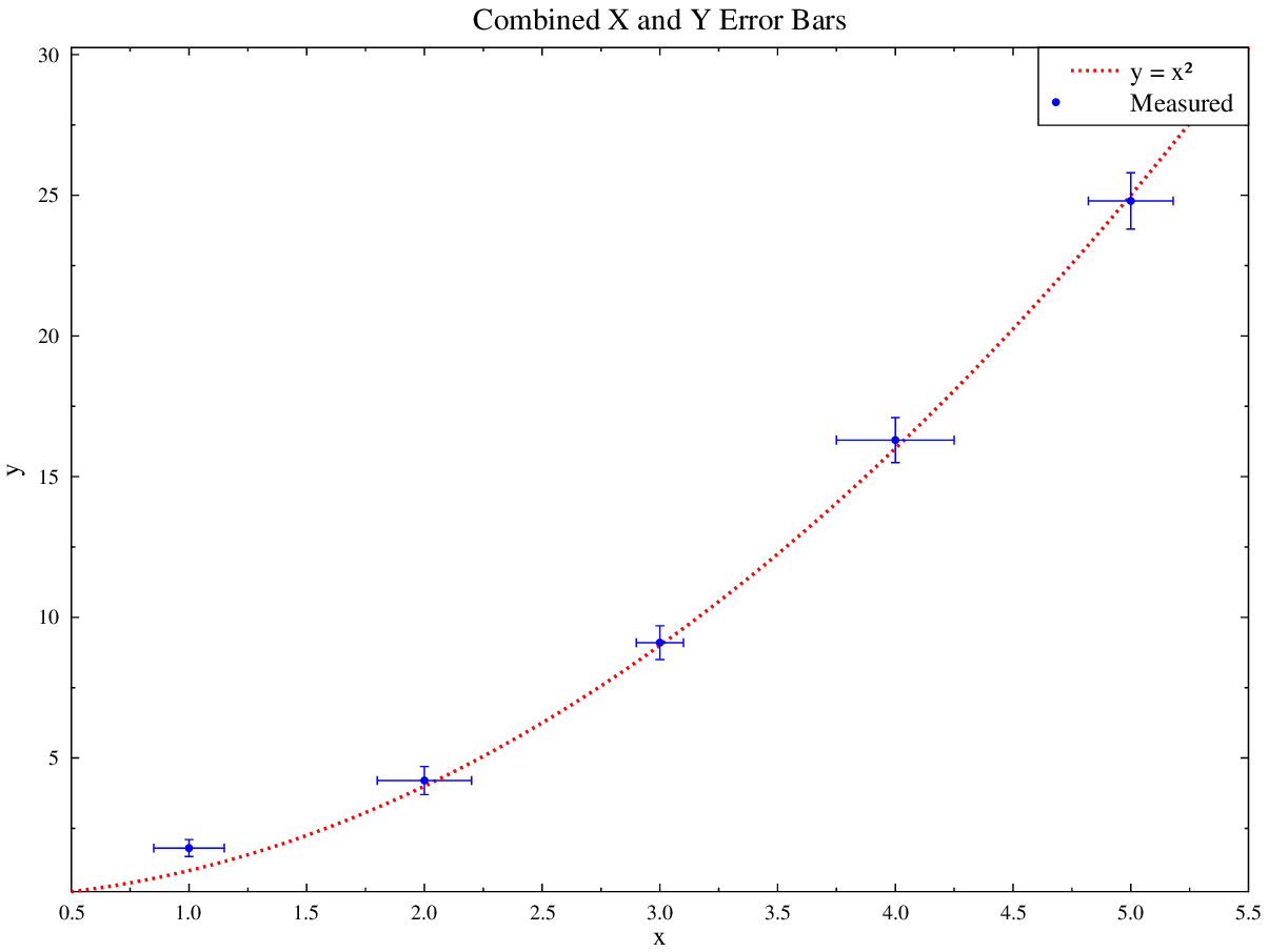
Combined X and Y Error Bars
Simultaneous horizontal and vertical error bars (uncertainty in both axes), overlaid with a fitted curve.
import numpy as np
import gleplot as glp

fig = glp.figure(figsize=(8, 6))
ax = fig.add_subplot(111)

x    = np.array([1.0, 2.0, 3.0, 4.0, 5.0])
y    = np.array([1.8, 4.2, 9.1, 16.3, 24.8])
xerr = np.array([0.15, 0.20, 0.10, 0.25, 0.18])
yerr = np.array([0.3,  0.5,  0.6,  0.8,  1.0])

ax.errorbar(x, y, yerr=yerr, xerr=xerr, marker='o', fmt='none',
            color='blue', capsize=4, label='Measured')

x_fit = np.linspace(0.5, 5.5, 100)
ax.plot(x_fit, x_fit**2, color='red', linestyle='--', label='y = x²')

ax.set_xlabel('x')
ax.set_ylabel('y')
ax.set_title('Combined X and Y Error Bars')
ax.legend()

fig.savefig('example_combined_errorbars.pdf')
Advanced Plots
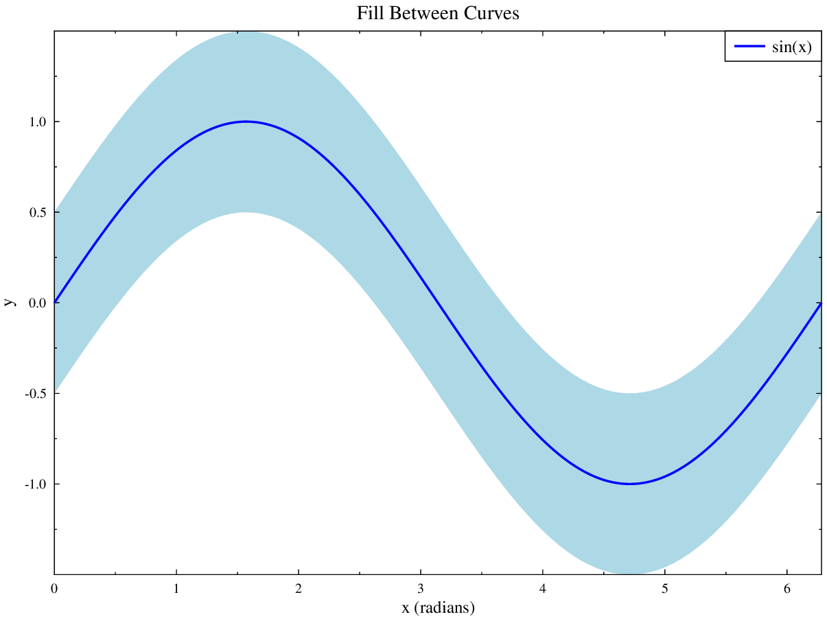
Fill Between
Shaded uncertainty band around a central line.
import numpy as np
import gleplot as glp

fig = glp.figure(figsize=(8, 6))
ax = fig.add_subplot(111)

x = np.linspace(0, 2*np.pi, 100)
y_upper = np.sin(x) + 0.5
y_lower = np.sin(x) - 0.5

ax.fill_between(x, y_lower, y_upper, color='lightblue', alpha=0.5, label='±0.5')
ax.plot(x, np.sin(x), color='blue', label='sin(x)')

ax.set_xlabel('x (radians)')
ax.set_ylabel('y')
ax.set_title('Fill Between Curves')
ax.legend()

fig.savefig('example_fill_between.pdf')
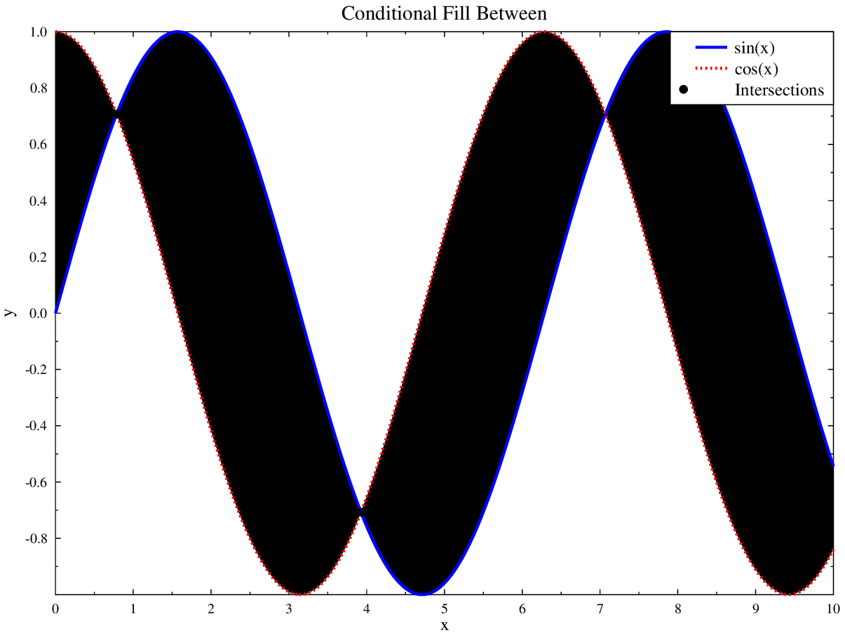
Conditional Fill Between
Fill regions are coloured differently depending on which curve is on top, using the where= parameter.
import numpy as np
import gleplot as glp

fig = glp.figure(figsize=(8, 6))
ax = fig.add_subplot(111)

x  = np.linspace(0, 10, 100)
y1 = np.sin(x)
y2 = np.cos(x)

ax.fill_between(x, y1, y2, where=(y1 >= y2), color='lightblue',
                alpha=0.5, label='sin ≥ cos')
ax.fill_between(x, y1, y2, where=(y1 < y2),  color='lightcoral',
                alpha=0.5, label='sin < cos')
ax.plot(x, y1, color='blue', linewidth=2, label='sin(x)')
ax.plot(x, y2, color='red',  linewidth=2, linestyle='--', label='cos(x)')

intersections_x = [np.pi/4, 5*np.pi/4]
intersections_y = [np.sin(np.pi/4), np.sin(5*np.pi/4)]
ax.scatter(intersections_x, intersections_y, color='black',
           marker='o', s=80, label='Intersections')

ax.set_xlabel('x')
ax.set_ylabel('y')
ax.set_title('Conditional Fill Between')
ax.legend()
ax.set_xlim(0, 10)

fig.savefig('example_fill_between_conditional.pdf')
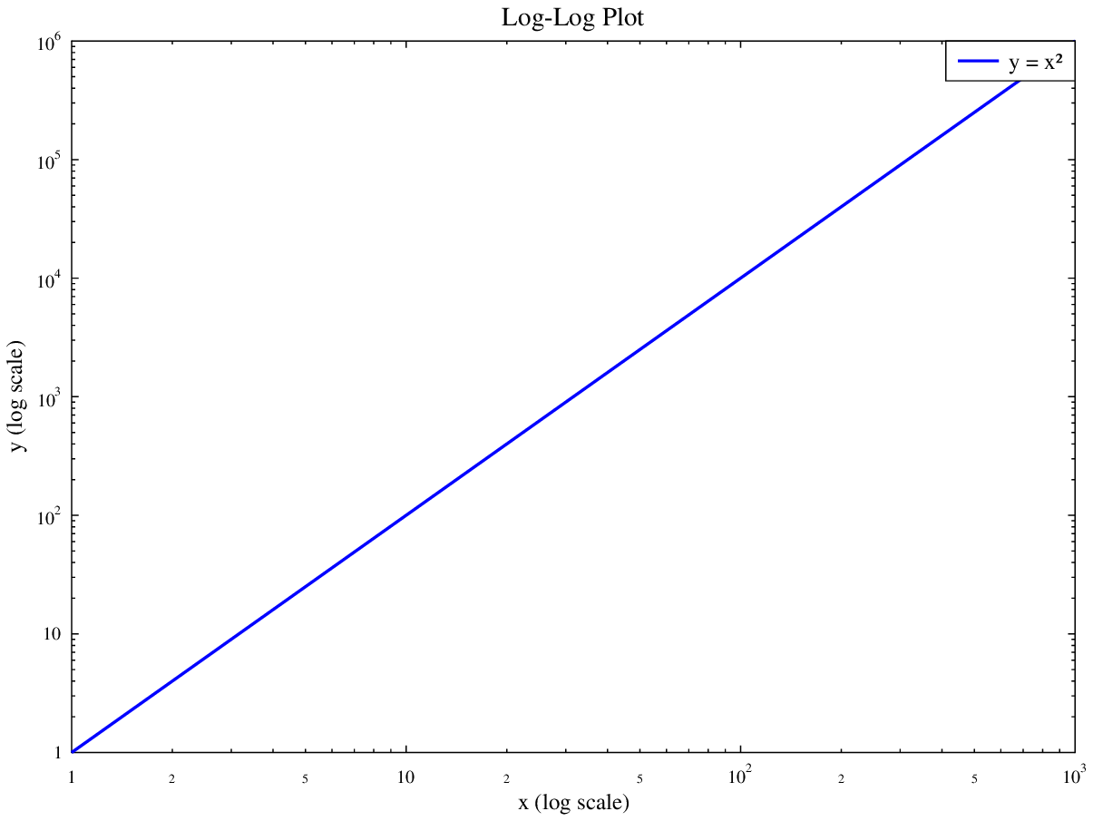
Logarithmic Scale
Log-log plot demonstrating a power-law relationship.
import numpy as np
import gleplot as glp

fig = glp.figure(figsize=(8, 6))
ax = fig.add_subplot(111)

x = np.logspace(0, 3, 50)
y = x**2

ax.plot(x, y, color='blue', marker='o', linestyle='-', label='y = x²')
ax.set_xscale('log')
ax.set_yscale('log')

ax.set_xlabel('x (log scale)')
ax.set_ylabel('y (log scale)')
ax.set_title('Log-Log Plot')
ax.legend()

fig.savefig('example_log_scale.pdf')
Multiple Line Styles and Markers
Demonstration of the available line styles and scatter markers.
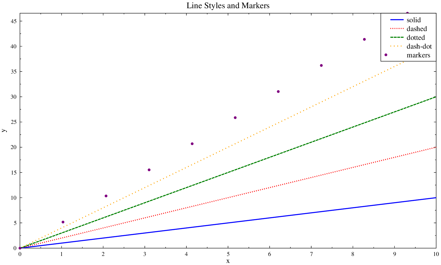
import numpy as np
import gleplot as glp

fig = glp.figure(figsize=(10, 6))
ax = fig.add_subplot(111)

x = np.linspace(0, 10, 30)

ax.plot(x, x,     color='blue',   linestyle='-',   label='solid')
ax.plot(x, 2*x,   color='red',    linestyle='--',  label='dashed')
ax.plot(x, 3*x,   color='green',  linestyle=':',   label='dotted')
ax.plot(x, 4*x,   color='orange', linestyle='-.', label='dash-dot')
ax.scatter(x[::3], 5*x[::3], color='purple', marker='o', s=40, label='markers')

ax.set_xlabel('x')
ax.set_ylabel('y')
ax.set_title('Line Styles and Markers')
ax.legend()

fig.savefig('example_multiple_styles.pdf')
Combined Plot
Lines, scatter, and fill_between combined in a single axes.
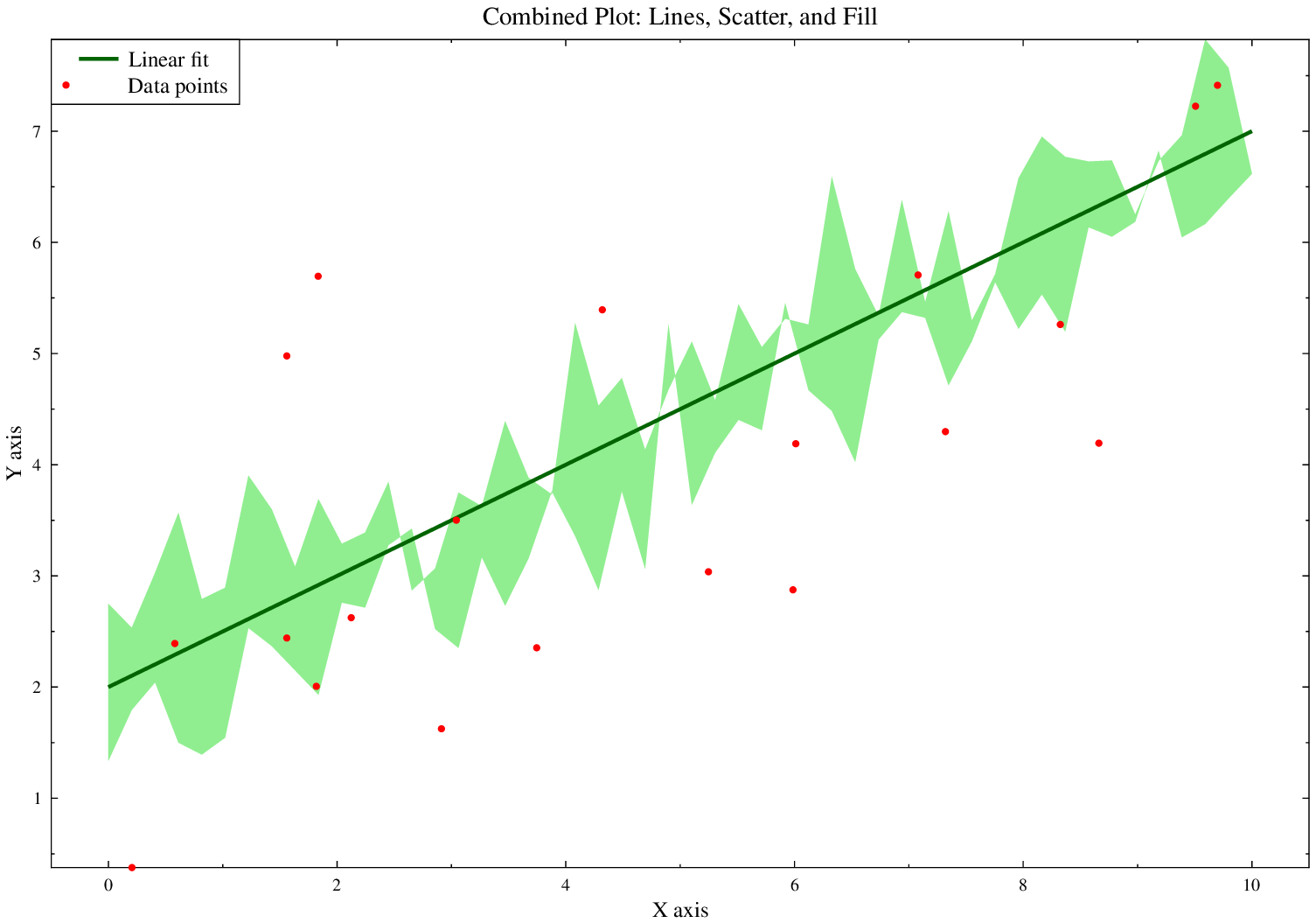
import numpy as np
import gleplot as glp

fig = glp.figure(figsize=(10, 7))
ax = fig.add_subplot(111)

x = np.linspace(0, 10, 50)
y_line = 0.5 * x + 2
y_upper = y_line + np.random.randn(len(x)) * 0.5 + 0.5
y_lower = y_line - np.random.randn(len(x)) * 0.5 - 0.5

ax.fill_between(x, y_lower, y_upper, color='lightgreen', alpha=0.3)
ax.plot(x, y_line, color='darkgreen', linewidth=2, label='Linear fit')

np.random.seed(42)
x_scatter = np.random.uniform(0, 10, 20)
y_scatter = 0.5 * x_scatter + 2 + np.random.randn(20) * 1.5
ax.scatter(x_scatter, y_scatter, color='red', marker='o', s=30, label='Data points')

ax.set_xlabel('X axis')
ax.set_ylabel('Y axis')
ax.set_title('Combined Plot: Lines, Scatter, and Fill')
ax.legend(loc='upper left')

fig.savefig('example_combined_plot.pdf')
Subplots
Side-by-Side Subplots (1×2)
Two plots side by side in a single figure.
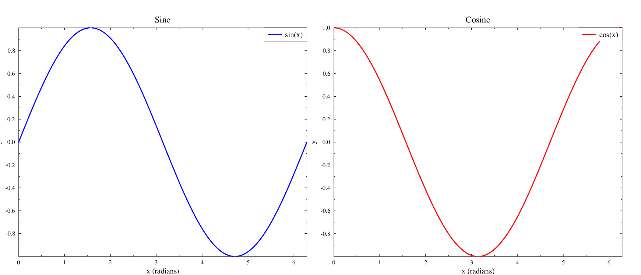
import numpy as np
import gleplot as glp

fig, axes = glp.subplots(1, 2, figsize=(14, 6))

x = np.linspace(0, 2 * np.pi, 80)

axes[0].plot(x, np.sin(x), color='blue', label='sin(x)')
axes[0].set_xlabel('x (radians)')
axes[0].set_ylabel('y')
axes[0].set_title('Sine')
axes[0].legend()

axes[1].plot(x, np.cos(x), color='red', label='cos(x)')
axes[1].set_xlabel('x (radians)')
axes[1].set_ylabel('y')
axes[1].set_title('Cosine')
axes[1].legend()

fig.savefig('example_subplots_1x2.pdf')
Stacked Subplots (2×1)
Two stacked panels: a fit with error bars on top and its residuals below.
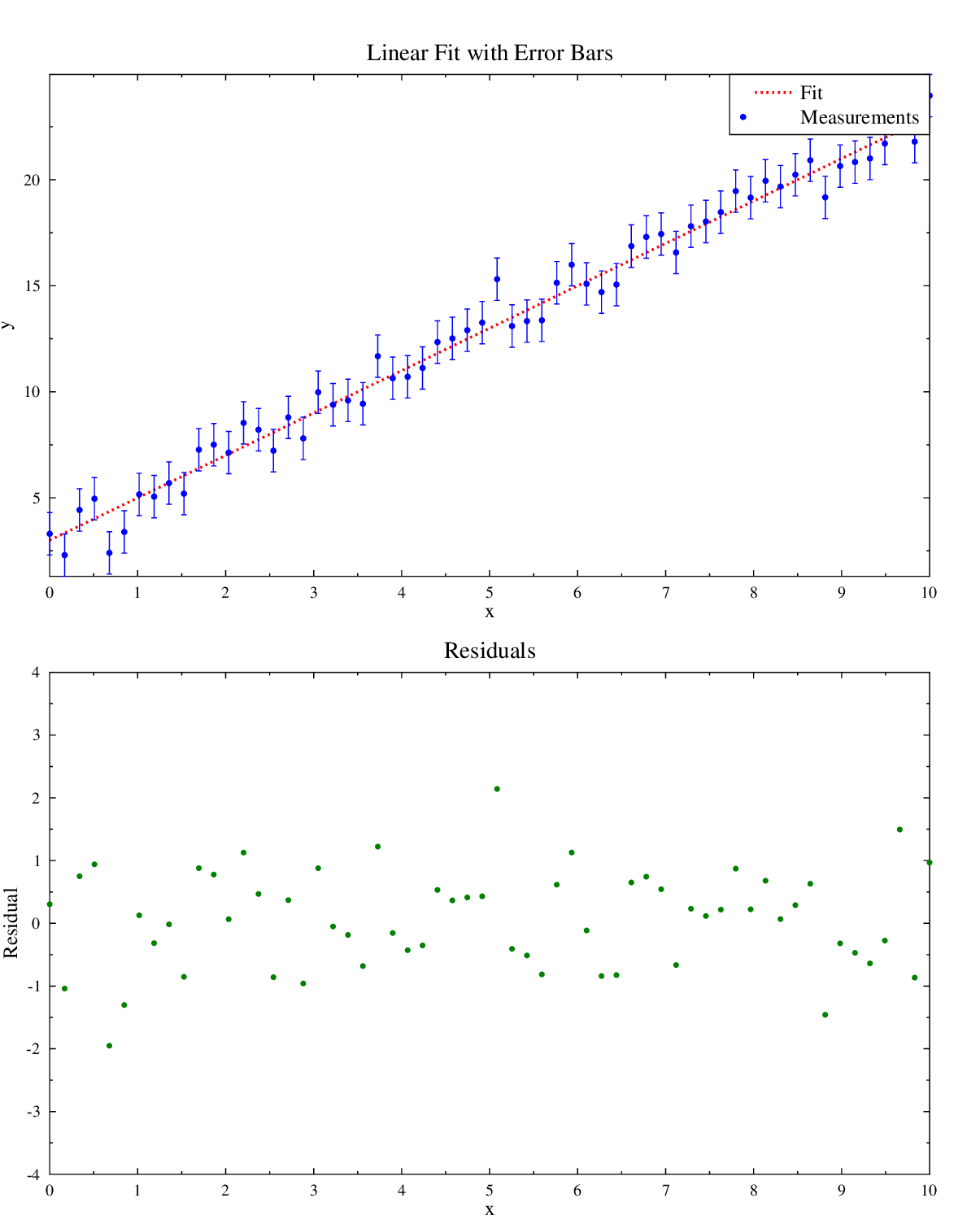
import numpy as np
import gleplot as glp

fig, axes = glp.subplots(2, 1, figsize=(8, 10))

x  = np.linspace(0, 10, 60)
y1 = 2 * x + 3 + np.random.default_rng(42).normal(0, 1, len(x))

axes[0].errorbar(x, y1, yerr=1.0, marker='o', fmt='none', color='blue',
                 label='Measurements')
axes[0].plot(x, 2 * x + 3, color='red', linestyle='--', label='Fit')
axes[0].set_xlabel('x')
axes[0].set_ylabel('y')
axes[0].set_title('Linear Fit with Error Bars')
axes[0].legend()

residuals = y1 - (2 * x + 3)
axes[1].scatter(x, residuals, color='green', marker='o')
axes[1].set_xlabel('x')
axes[1].set_ylabel('Residual')
axes[1].set_title('Residuals')
axes[1].set_ylim(-4, 4)

fig.savefig('example_subplots_2x1.pdf')
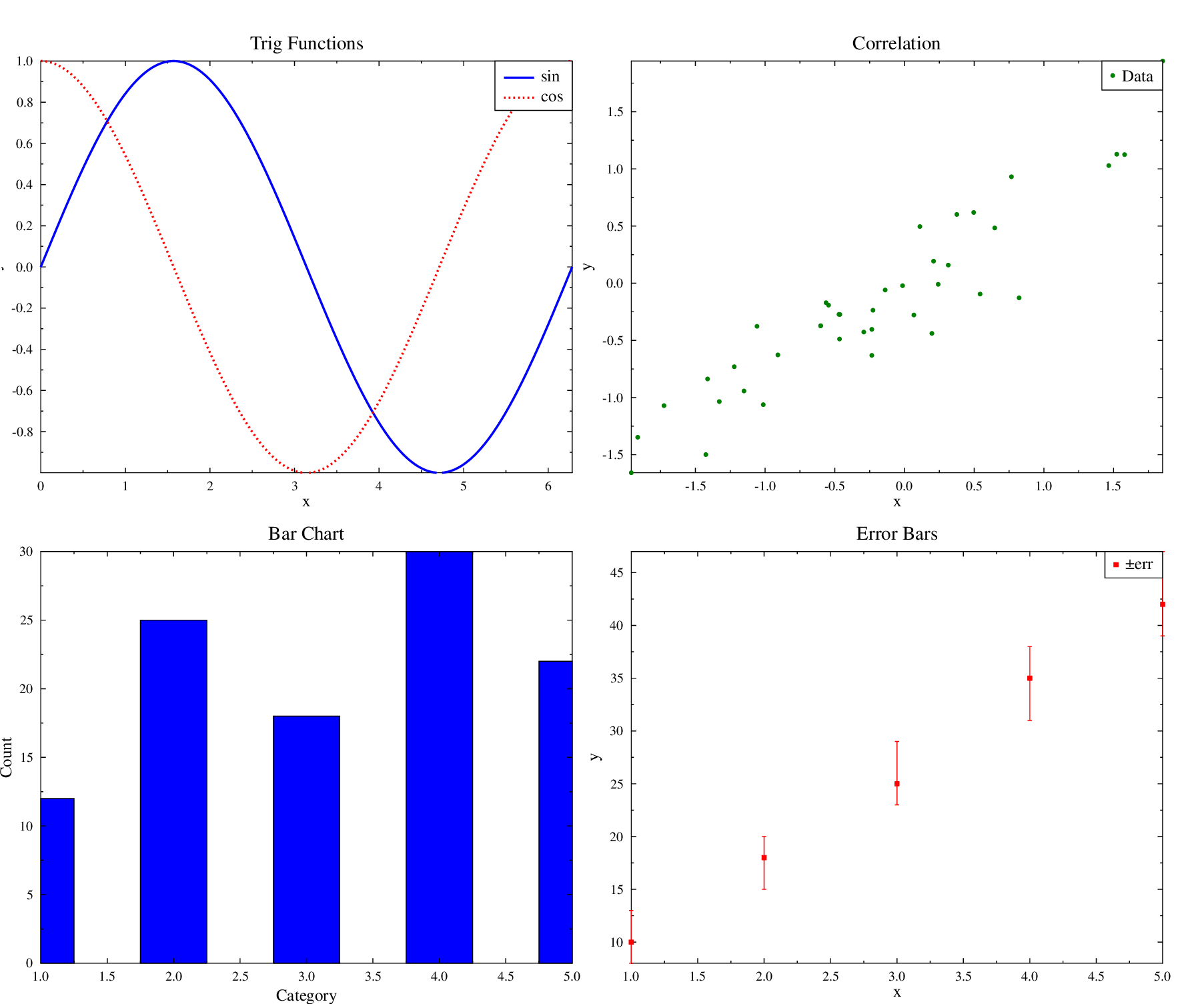
2×2 Subplot Grid with Mixed Types
Four different plot types in a single 2×2 figure: line, scatter, bar, and asymmetric error bars.
import numpy as np
import gleplot as glp

fig, axes = glp.subplots(2, 2, figsize=(12, 10))

x = np.linspace(0, 2 * np.pi, 50)

axes[0].plot(x, np.sin(x), color='blue', label='sin')
axes[0].plot(x, np.cos(x), color='red', linestyle='--', label='cos')
axes[0].set_title('Trig Functions')
axes[0].set_xlabel('x')
axes[0].set_ylabel('y')
axes[0].legend()

np.random.seed(42)
xs = np.random.randn(40)
ys = 0.8 * xs + np.random.randn(40) * 0.3
axes[1].scatter(xs, ys, color='green', marker='o', label='Data')
axes[1].set_title('Correlation')
axes[1].set_xlabel('x')
axes[1].set_ylabel('y')

categories = np.array([1, 2, 3, 4, 5])
values     = np.array([12, 25, 18, 30, 22])
axes[2].bar(categories, values, color='blue')
axes[2].set_title('Bar Chart')
axes[2].set_xlabel('Category')
axes[2].set_ylabel('Count')

xm = np.array([1, 2, 3, 4, 5])
ym = np.array([10, 18, 25, 35, 42])
axes[3].errorbar(xm, ym, yerr=([2, 3, 2, 4, 3], [3, 2, 4, 3, 5]),
                 marker='s', fmt='none', color='red', capsize=3, label='±err')
axes[3].set_title('Error Bars')
axes[3].set_xlabel('x')
axes[3].set_ylabel('y')
axes[3].legend()

fig.savefig('example_subplots_2x2.pdf')
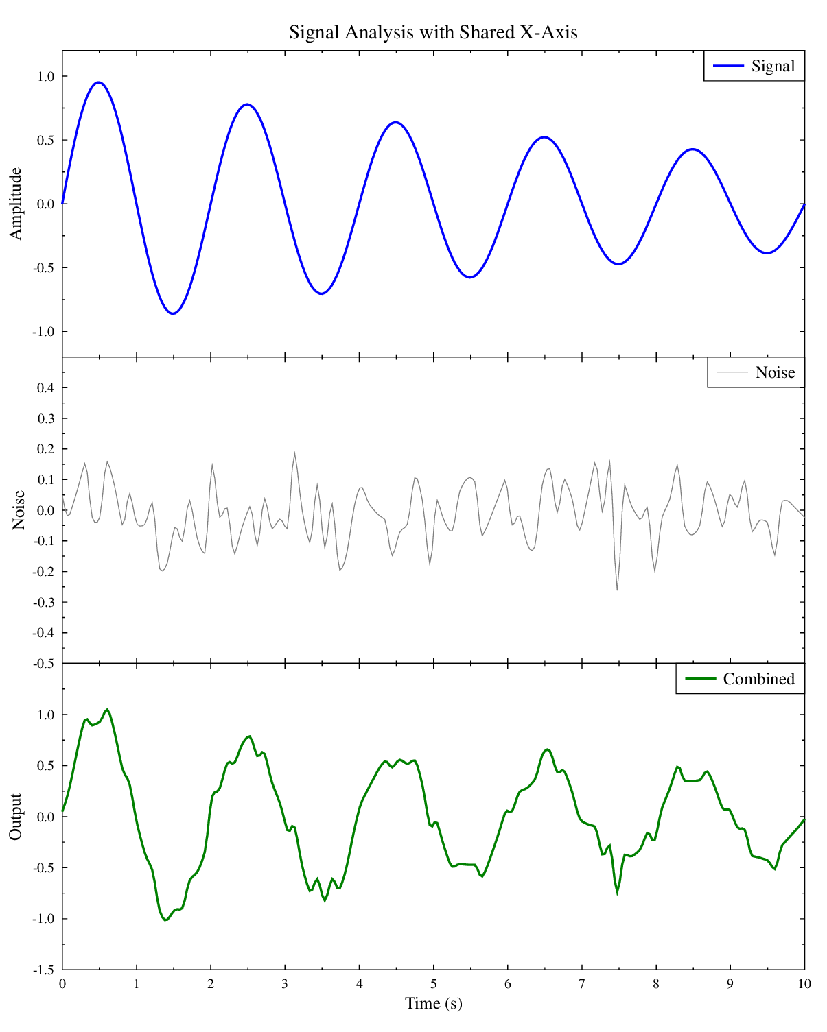
Shared Axes and Multi-Panel Figures
Shared X-Axis
Three vertically-stacked plots sharing a common x-axis. Only the bottom panel shows x-tick labels, creating a clean aligned layout.
import numpy as np
import gleplot as glp

fig, axes = glp.subplots(3, 1, sharex=True, figsize=(8, 10))

x = np.linspace(0, 10, 100)

signal = np.sin(2 * np.pi * 0.5 * x) * np.exp(-x / 10)
axes[0].plot(x, signal, color='blue', label='Signal')
axes[0].set_ylabel('Amplitude')
axes[0].set_title('Signal Analysis with Shared X-Axis')
axes[0].legend()

np.random.seed(42)
noise = np.random.normal(0, 0.1, len(x))
axes[1].plot(x, noise, color='gray', linewidth=0.5, label='Noise')
axes[1].set_ylabel('Noise')
axes[1].legend()

combined = signal + noise
axes[2].plot(x, combined, color='green', label='Combined')
axes[2].set_xlabel('Time (s)')
axes[2].set_ylabel('Output')
axes[2].legend()

fig.savefig('example_shared_x_axis.pdf')
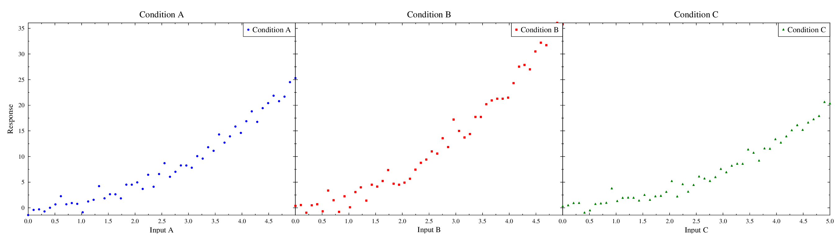
Shared Y-Axis
Three side-by-side plots sharing a common y-axis. Only the leftmost panel shows y-tick labels for direct comparison across conditions.
import numpy as np
import gleplot as glp

fig, axes = glp.subplots(1, 3, sharey=True, figsize=(18, 5))

x = np.linspace(0, 5, 50)
np.random.seed(42)

y1 = x**2 + np.random.normal(0, 1, len(x))
axes[0].scatter(x, y1, color='blue', marker='o', label='Condition A')
axes[0].set_xlabel('Input A')
axes[0].set_ylabel('Response')
axes[0].set_title('Condition A')
axes[0].legend()

y2 = 1.5 * x**2 + np.random.normal(0, 1.5, len(x))
axes[1].scatter(x, y2, color='red', marker='s', label='Condition B')
axes[1].set_xlabel('Input B')
axes[1].set_title('Condition B')
axes[1].legend()

y3 = 0.8 * x**2 + np.random.normal(0, 0.8, len(x))
axes[2].scatter(x, y3, color='green', marker='^', label='Condition C')
axes[2].set_xlabel('Input C')
axes[2].set_title('Condition C')
axes[2].legend()

fig.savefig('example_shared_y_axis.pdf')
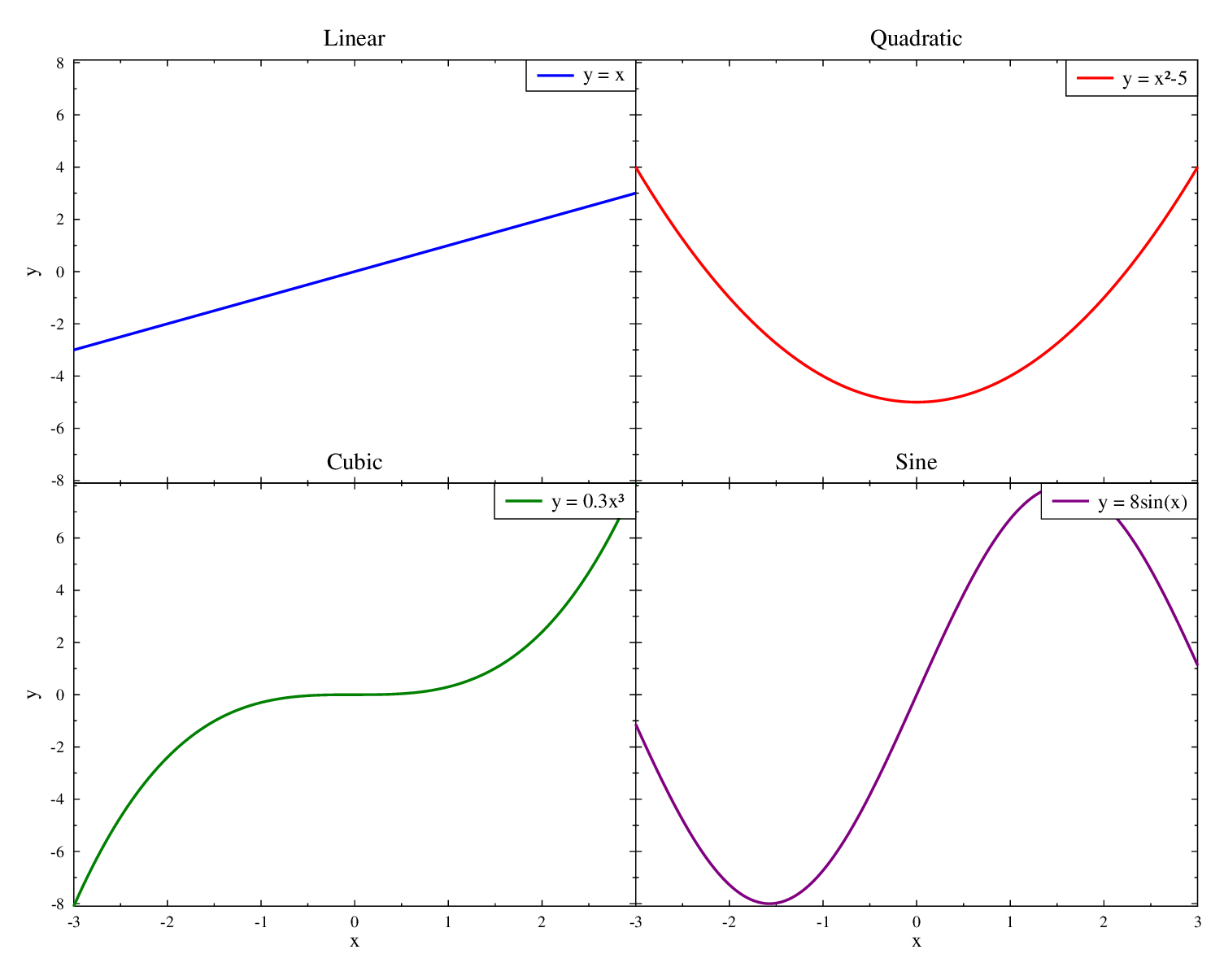
Shared Both Axes (2×2)
Four panels with both x and y axes shared. Only the left column shows y-tick labels and the bottom row shows x-tick labels.
import numpy as np
import gleplot as glp

fig, axes = glp.subplots(2, 2, sharex=True, sharey=True, figsize=(10, 8))

x = np.linspace(-3, 3, 60)

axes[0].plot(x, x,          color='blue',   label='y = x')
axes[0].set_ylabel('y')
axes[0].set_title('Linear')
axes[0].legend()

axes[1].plot(x, x**2 - 5,   color='red',    label='y = x²-5')
axes[1].set_title('Quadratic')
axes[1].legend()

axes[2].plot(x, 0.3*x**3,   color='green',  label='y = 0.3x³')
axes[2].set_xlabel('x')
axes[2].set_ylabel('y')
axes[2].set_title('Cubic')
axes[2].legend()

axes[3].plot(x, 8*np.sin(x), color='purple', label='y = 8sin(x)')
axes[3].set_xlabel('x')
axes[3].set_title('Sine')
axes[3].legend()

fig.savefig('example_shared_both_axes.pdf')
Working with Data Files
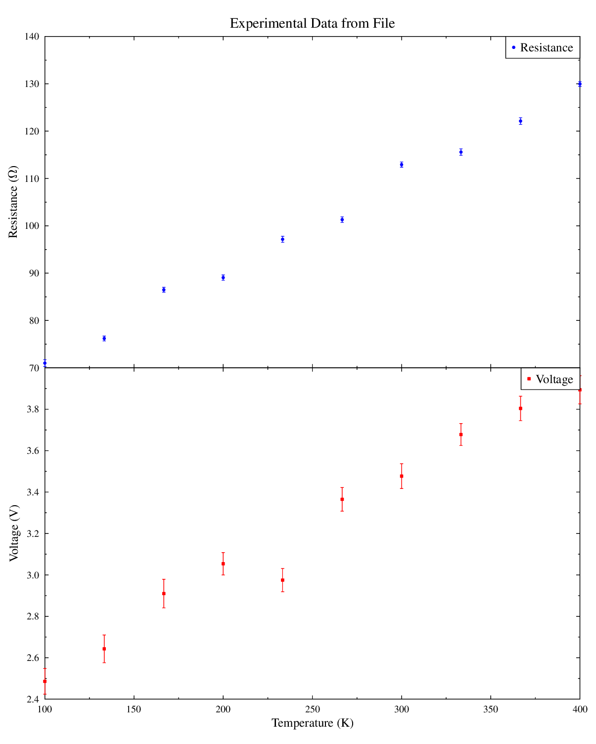
Error Bars from File
Plot error bars by referencing columns directly from an existing data file, avoiding the need to generate additional temporary data files.
import numpy as np
import gleplot as glp
from pathlib import Path

# Create experimental data file
data_file = Path('experimental_data.dat')

with open(data_file, 'w') as f:
    f.write("! Temp   Resistance  R_Error  Voltage  V_Error\n")
    np.random.seed(42)
    temps = np.linspace(100, 400, 10)
    for T in temps:
        R = 50 + 0.2 * T + np.random.randn() * 2
        R_err = 0.5 + np.random.rand() * 0.3
        V = 2.0 + 0.005 * T + np.random.randn() * 0.1
        V_err = 0.05 + np.random.rand() * 0.02
        f.write(f"{T:8.1f} {R:12.3f} {R_err:10.3f} {V:10.3f} {V_err:10.3f}\n")

# Create figure with two subplots
fig, axes = glp.subplots(2, 1, figsize=(8, 10), sharex=True)

# Top: Resistance vs Temperature
axes[0].errorbar_from_file(
    str(data_file),
    x_col=1,        # Temperature
    y_col=2,        # Resistance
    yerr_col=3,     # Error
    color='blue',
    marker='o',
    capsize=3,
    label='Resistance'
)
axes[0].set_ylabel('Resistance (Ω)')
axes[0].set_title('Experimental Data from File')
axes[0].legend()

# Bottom: Voltage vs Temperature
axes[1].errorbar_from_file(
    str(data_file),
    x_col=1,        # Temperature
    y_col=4,        # Voltage
    yerr_col=5,     # Error
    color='red',
    marker='s',
    capsize=3,
    label='Voltage'
)
axes[1].set_xlabel('Temperature (K)')
axes[1].set_ylabel('Voltage (V)')
axes[1].legend()

fig.savefig('example_errorbar_from_file.pdf')
Line Overlay from File
Overlay a smooth model/fit line from file columns directly on top of measured
points, without writing generated data_*.dat line files.
import gleplot as glp

fig = glp.figure(figsize=(8, 6))
ax = fig.add_subplot(111)

# data columns: c1=x, c2=y, c3=yerr, c4=fit
ax.errorbar_from_file(
   'fit_results.dat',
   x_col=1,
   y_col=2,
   yerr_col=3,
   color='blue',
   marker='o',
   capsize=3,
   label='Data'
)

ax.line_from_file(
   'fit_results.dat',
   x_col=1,
   y_col=4,
   color='red',
   linestyle='--',
   linewidth=2,
   label='Fit'
)

ax.set_xlabel('x')
ax.set_ylabel('y')
ax.set_title('Data + Fit Overlay from File')
ax.legend()

fig.savefig('example_line_from_file_overlay.pdf')
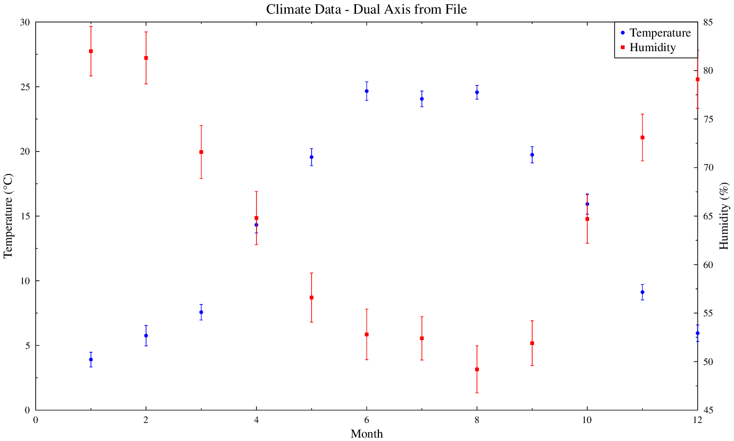
Dual Y-Axis from File
Dual y-axis plot using data file column references, perfect for plotting variables with different scales from the same dataset.
import numpy as np
import gleplot as glp
from pathlib import Path

# Create climate data file
data_file = Path('climate_data.dat')

with open(data_file, 'w') as f:
    f.write("! Month  Temp(C)  T_err  Humidity(%)  H_err\n")
    np.random.seed(123)
    for month in range(1, 13):
        temp = 15 + 10 * np.sin((month - 4) * np.pi / 6) + np.random.randn()
        t_err = 0.5 + np.random.rand() * 0.3
        humidity = 65 + 15 * np.cos((month - 1) * np.pi / 6) + np.random.randn() * 2
        h_err = 2 + np.random.rand()
        f.write(f"{month:4.0f} {temp:10.2f} {t_err:8.2f} {humidity:12.1f} {h_err:8.2f}\n")

# Create figure with dual y-axis
fig = glp.figure(figsize=(10, 6))
ax = fig.add_subplot(111)

# Temperature on left axis
ax.errorbar_from_file(
    str(data_file),
    x_col=1, y_col=2, yerr_col=3,
    color='blue',
    marker='o',
    yaxis='y',
    label='Temperature'
)

# Humidity on right axis
ax.errorbar_from_file(
    str(data_file),
    x_col=1, y_col=4, yerr_col=5,
    color='red',
    marker='s',
    yaxis='y2',
    label='Humidity'
)

ax.set_xlabel('Month')
ax.set_ylabel('Temperature (°C)', axis='y')
ax.set_ylabel('Humidity (%)', axis='y2')
ax.set_title('Climate Data - Dual Axis from File')
ax.legend()

fig.savefig('example_dual_axis_from_file.pdf')
Generating Your Own Gallery
All plots shown here are generated by running:
cd examples
python run_and_compile.py
The script creates both .gle scripts and compiled output files (PDF, EPS, PNG)
in the examples/outputs directory. GLE source files are tracked in the repository
for reference, while compiled outputs are excluded via .gitignore.
Additional advanced scripts available in examples/advanced:
text_annotations.pyper_element_styling.pybatch_figures.pyline_from_file.pydata_prefix.py